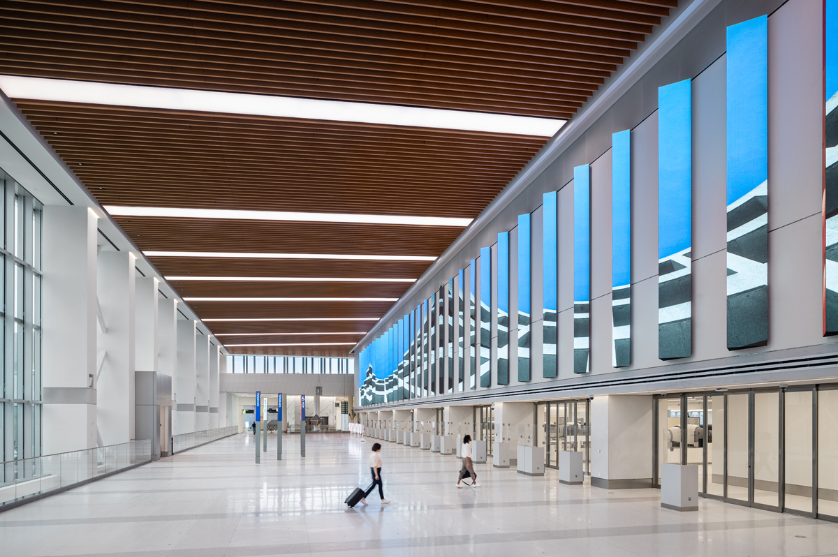
Delta Terminal C, La Guardia Airport, NY / 2022
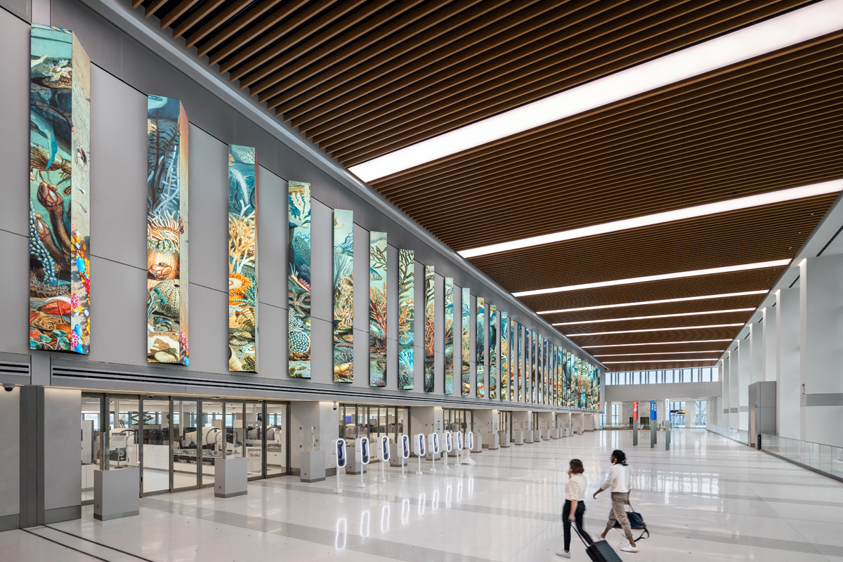
Delta, one of the world's leading airlines, incorporates a wide variety of art into it’s many spaces around the world to create a connection between customers and its brand. Delta wanted to enhance the customer experience at their brand new LaGuardia Airport terminal by commissioning us to design an iconic art, media, and graphics program that embodies the spirit of travel. Our approach focused on the two primary aspects of the travel experience: departures and arrivals, which share similar pain points of waiting in security or at the baggage carousel, and feelings of anticipation to embark on a flight or reach the final destination. These themes were used as the design strategy for the new Delta Terminal activations.
The departure hall features tall vertical columns of high-resolution LEDs that activate the entrance to the terminal. This setup showcases picturesque visuals that remind travelers of the joys of traveling and offers a much-needed distraction as they navigate through security. The content displayed is influenced by live flight data, and captures the fleeting essence of travel by displaying imagry from exciting Delta Airlines destinations.
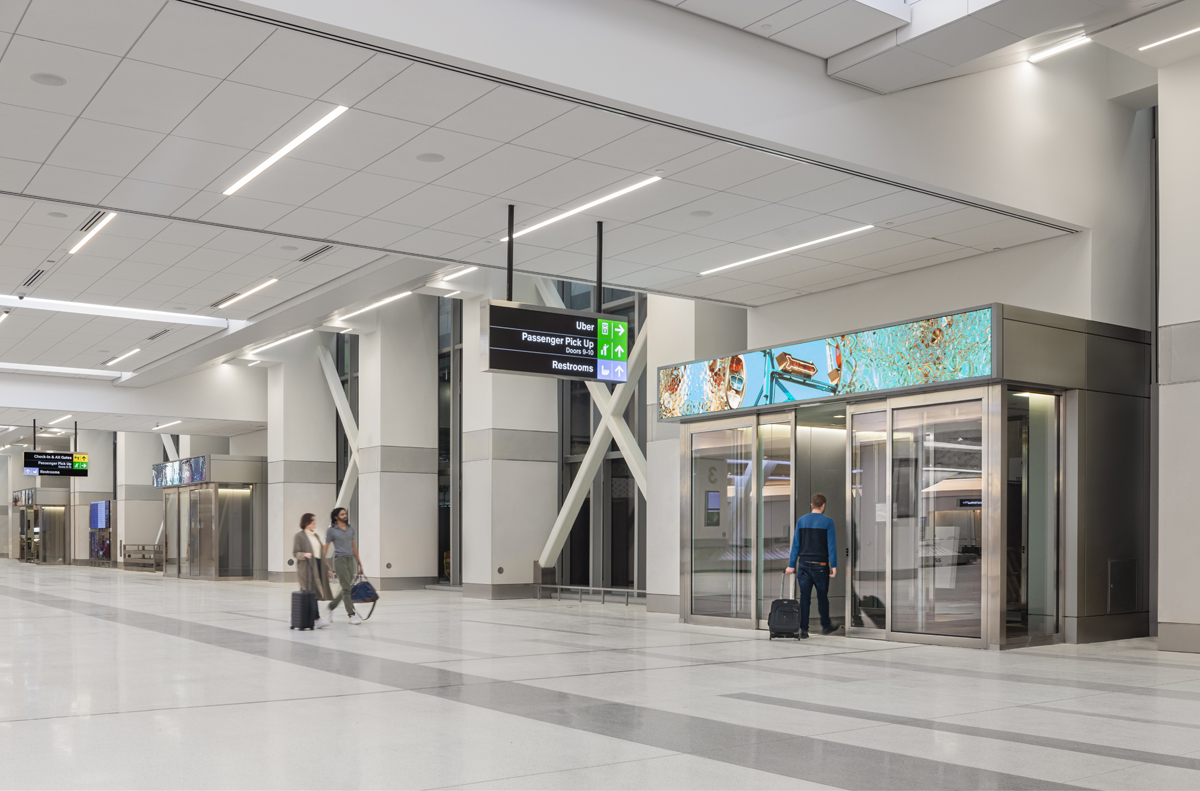
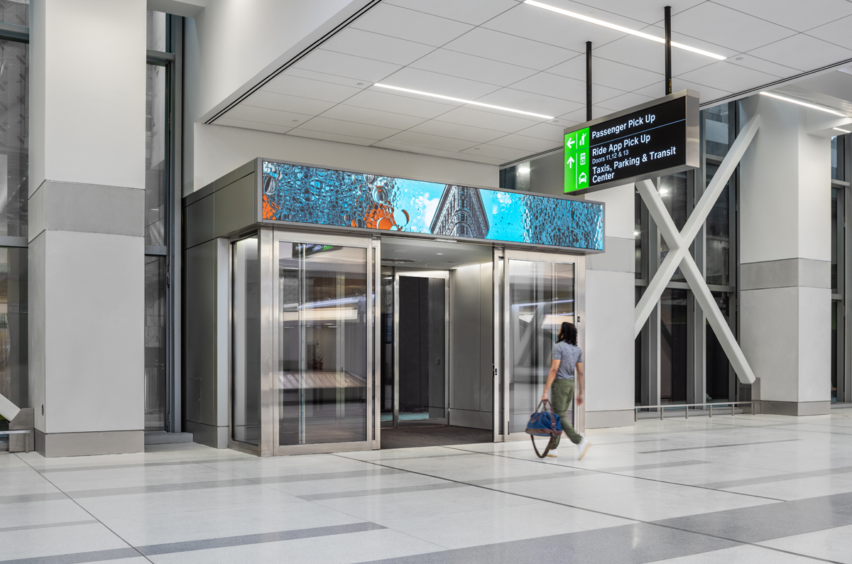
At the baggage claim, there are four high-resolution media bands located at the exits that display iconic New York City imagry. As passengers pass through these areas, the media reacts their presence by reorganizing to offer a unique perspective of the city, with an engaging focus that reveals intricate details within the visuals.
CN Core Responsibilities /
/Senior Physical Designer
/3d design, detailing and rendering
/Lighting prototyping
/Construction administration


Client / Delta Airlines
Experience Design / ESI Design
Architect / Corgan
Specialty Fabricator / Dimensional World Wide
LED integrator / Standard Vision
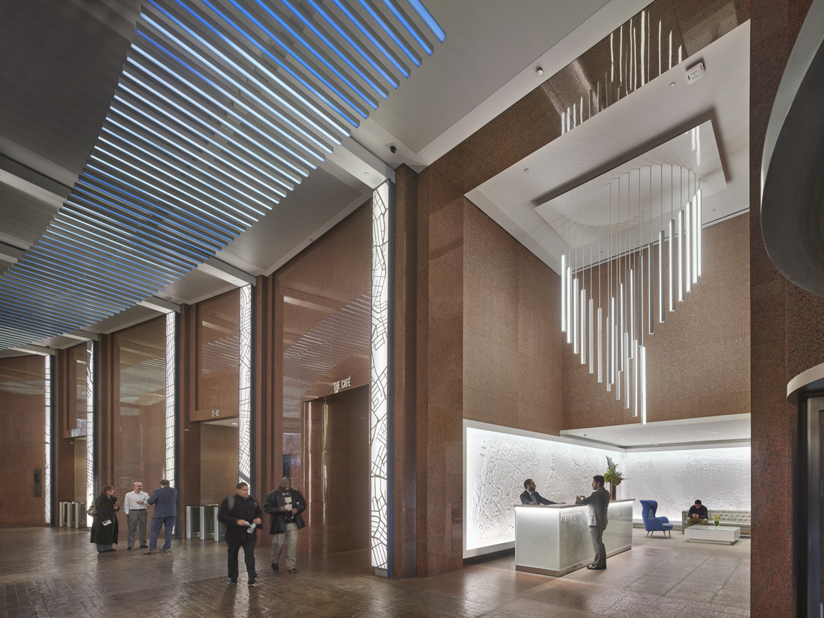
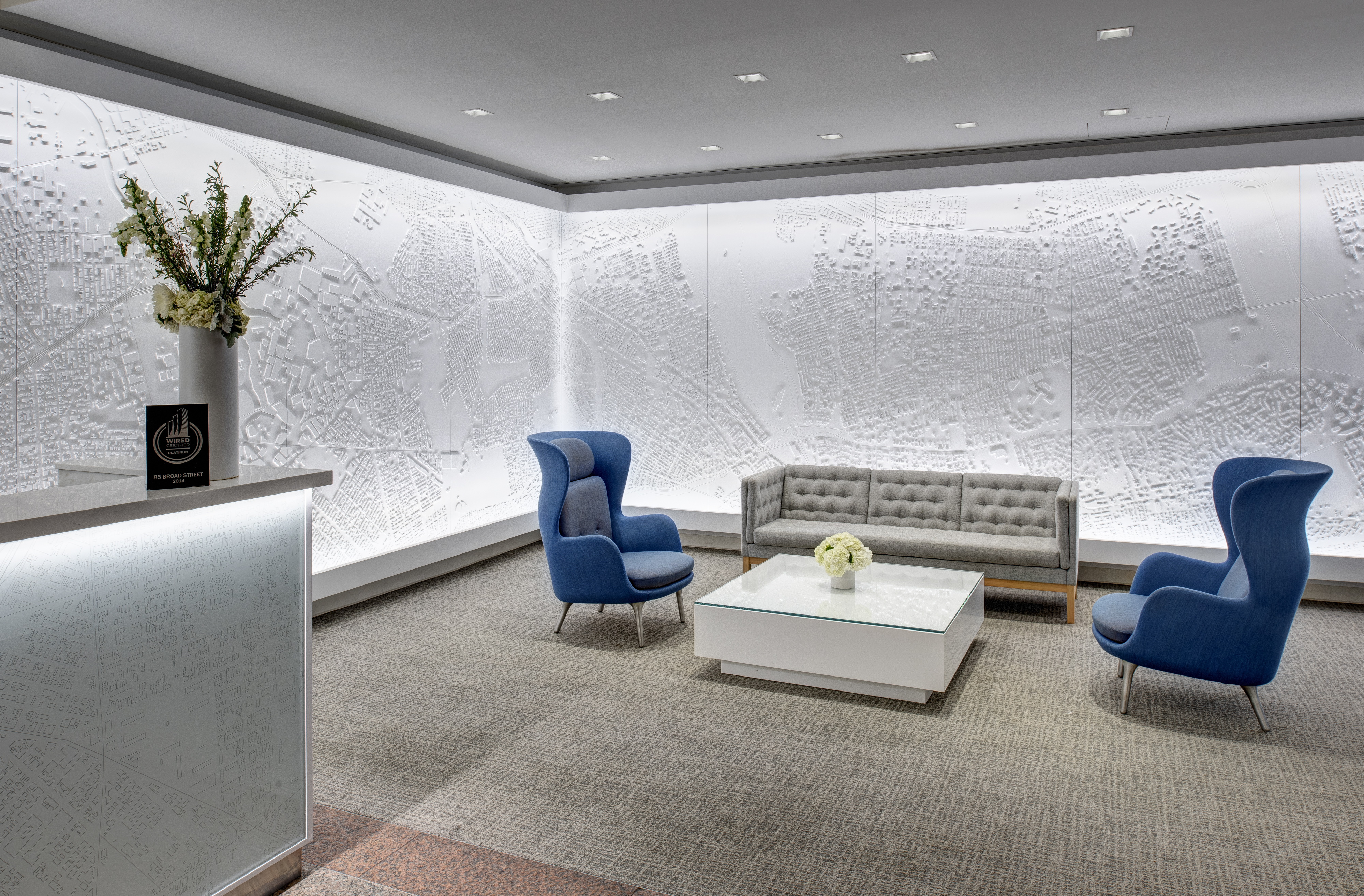
85 Broad St, New York, NY / 2016
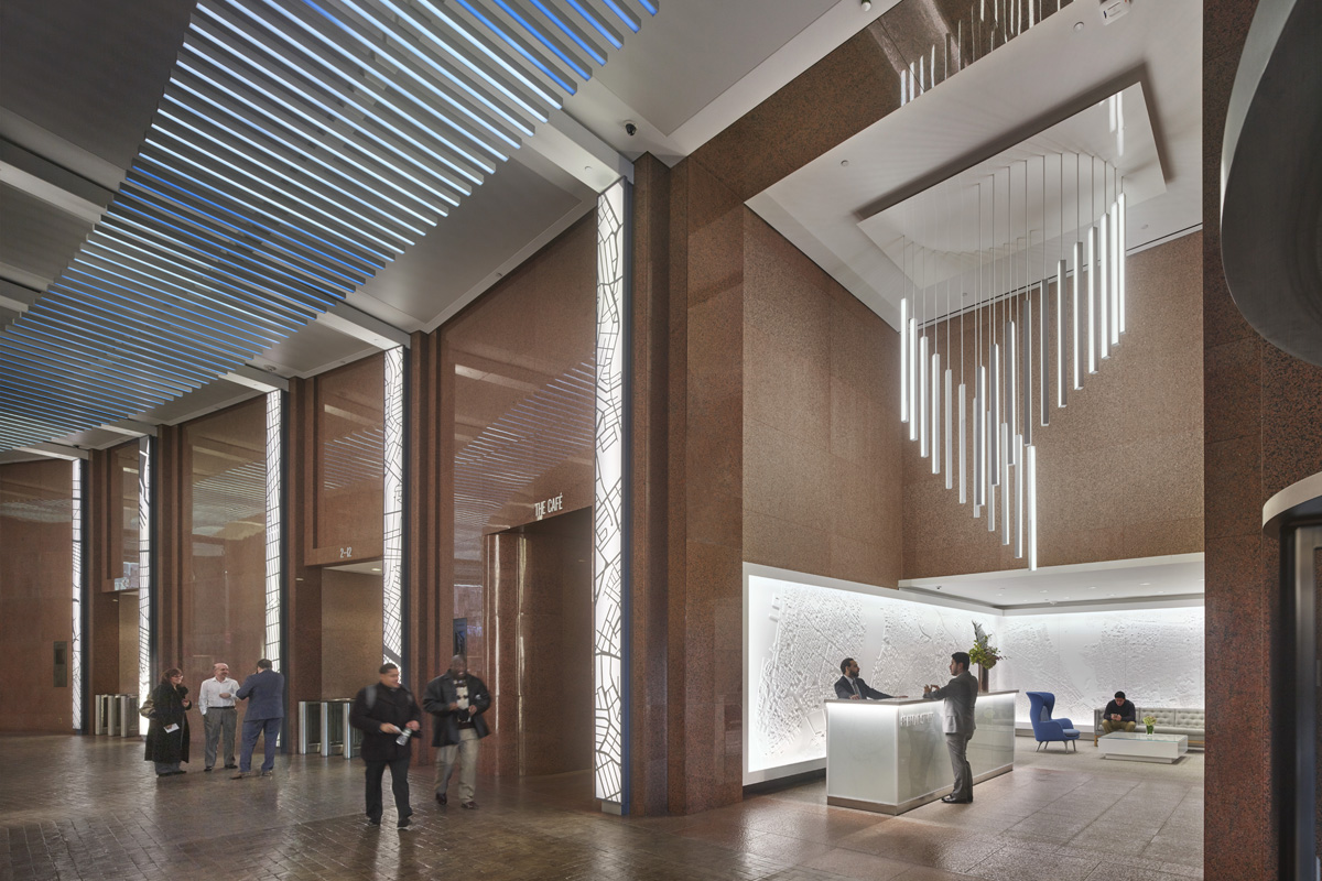
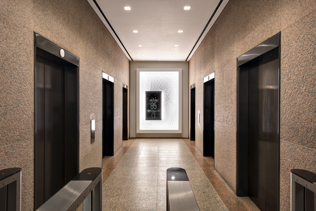
When Beacon Capital Partners bought 85 Broad Street, the building had not been significantly renovated for more than three decades since its construction. To attract media and technology tenants, Beacon recruited us to lead an experiential design-focused lobby renovation project.
A curved corridor, replicating the original path of Stone Street from colonial times, runs through the center of the lobby. The design team faced a complex challenge since the cobblestone-like path could not be changed due to city regulations. Nonetheless, our team of experts seamlessly integrated digital media, software-driven lighting, and wayfinding graphics to retell the story of 85 Broad in a lively and engaging manner.
We transformed the dimly lit corridor into a bright and engaging space by installing light bars that doubled as a custom low-resolution video ceiling, featuring subtle lighting patterns. For instance, one animation depicts the sky and clouds, creating the impression that the corridor is open to the air, similar to when it was a street.
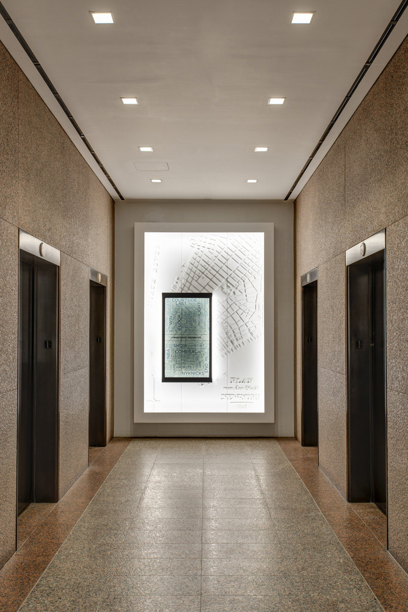
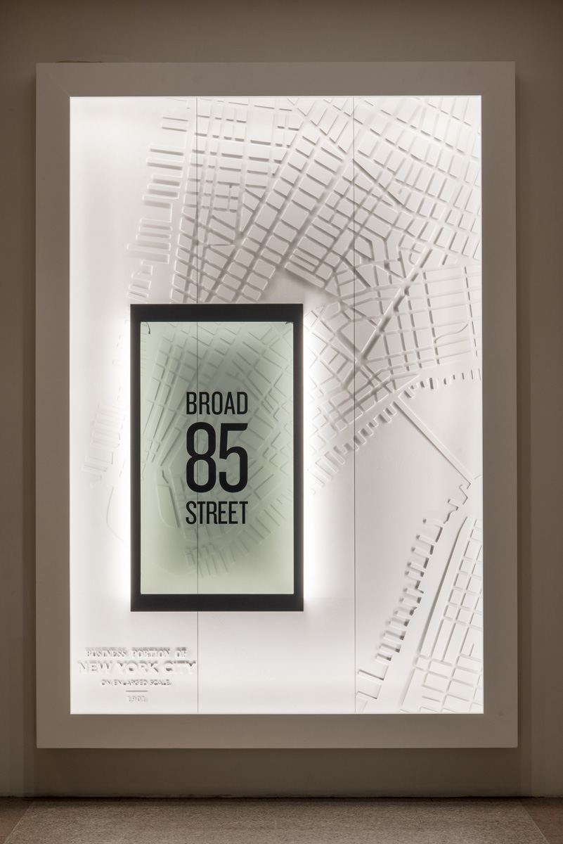
To highlight the unique and historic location of 85 Broad within the city, seven expansive relief maps of Manhattan adorn the walls of the entryways. Sculptural chandeliers were also incorporated to complement the light bars that run down the corridor.
At the end of each elevator bay, transparent LCD screens were mounted over the historical relief maps, providing a mix of opacity and clarity that alternately obscures and reveals the details of the maps beneath. The screens display real-time content, such as local weather, traffic updates, and social media trends, that can be useful for visitors.
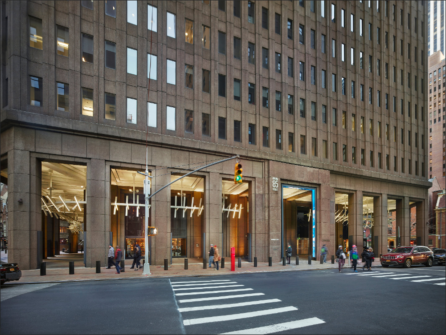
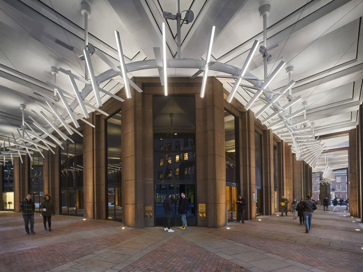
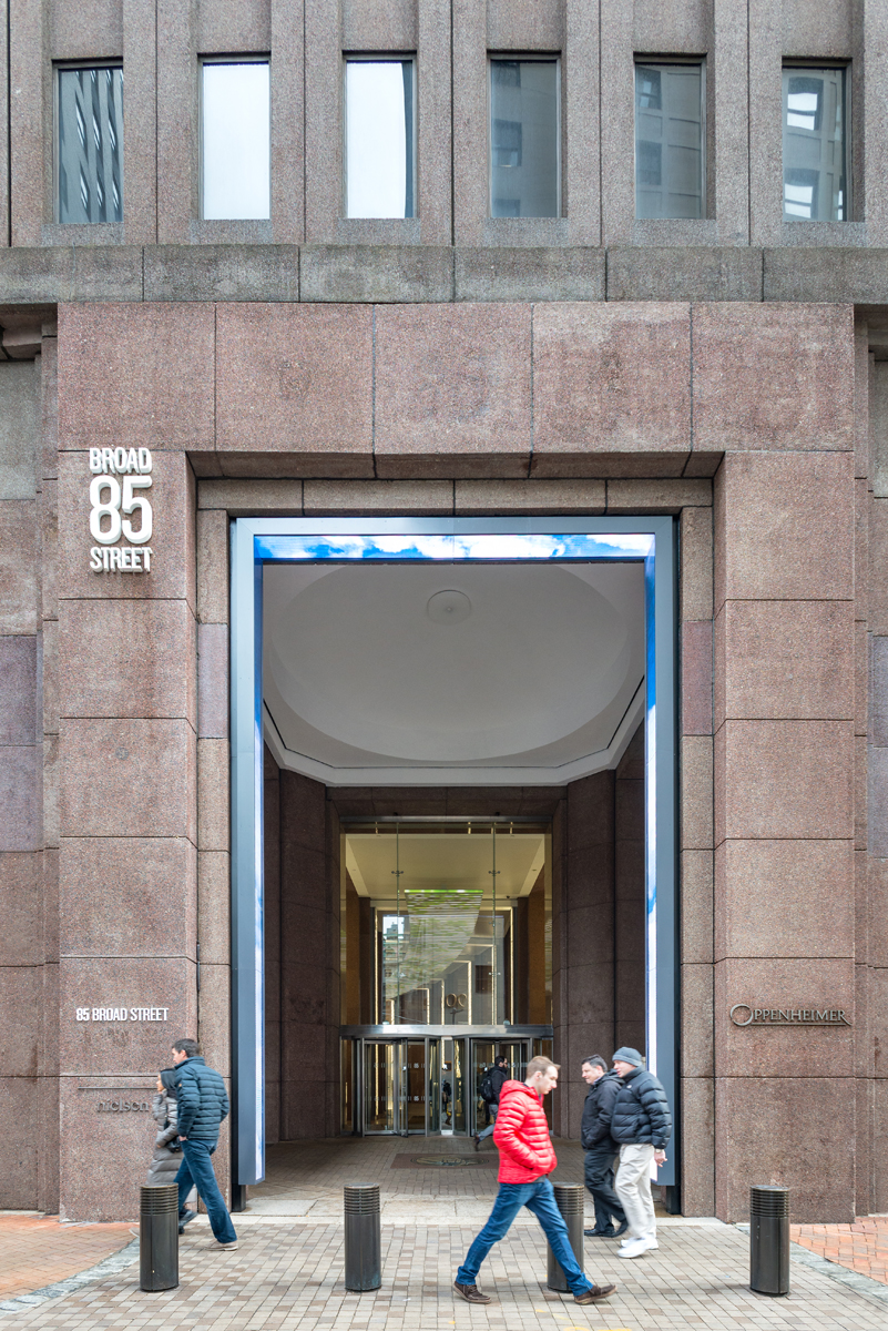
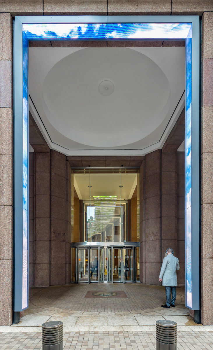
To guide pedestrians down the path of old Stone Street, the building's two exterior entrances are adorned with oversized LED arches that announce the entrance. The Broad Street arch is particularly striking as it features geometric animations, map imagery, and generative text patterns that relate to the custom media inside.
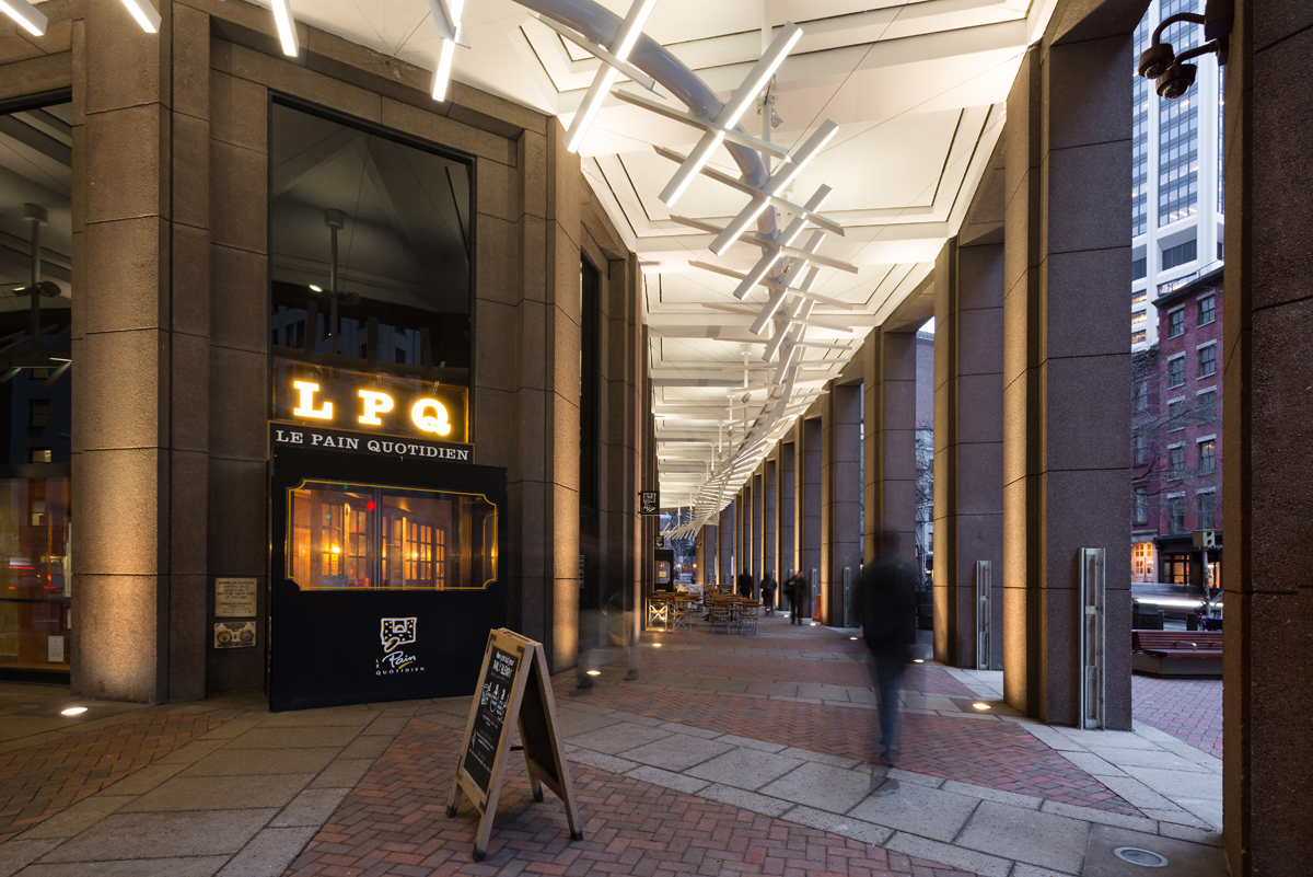
The building's exterior arcade boasts a captivating light installation that spirals through it, comprising light bars and reflective blades that alternate and twist, creating a dynamic and visually appealing effect. The installation adds a "wow" factor to the building's exterior.
CN Core Responsibilities /
-Senior Physical Designer
-3d design, detailing and rendering
-Lighting prototyping
-Construction administration

Client / Beacon Capital Partners
Experience Design / ESI Design
Architect / nbbj
Specialty Fabricator / Dimensional World Wide
Lighting Designer / upLIGHT

303 East Wacker Dr, Chicago, IL / 2021
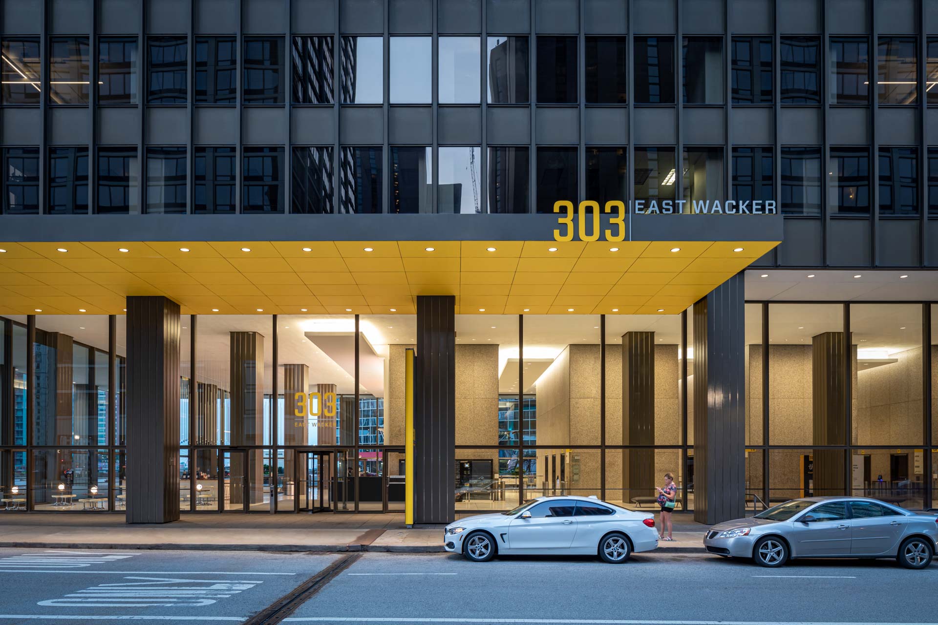
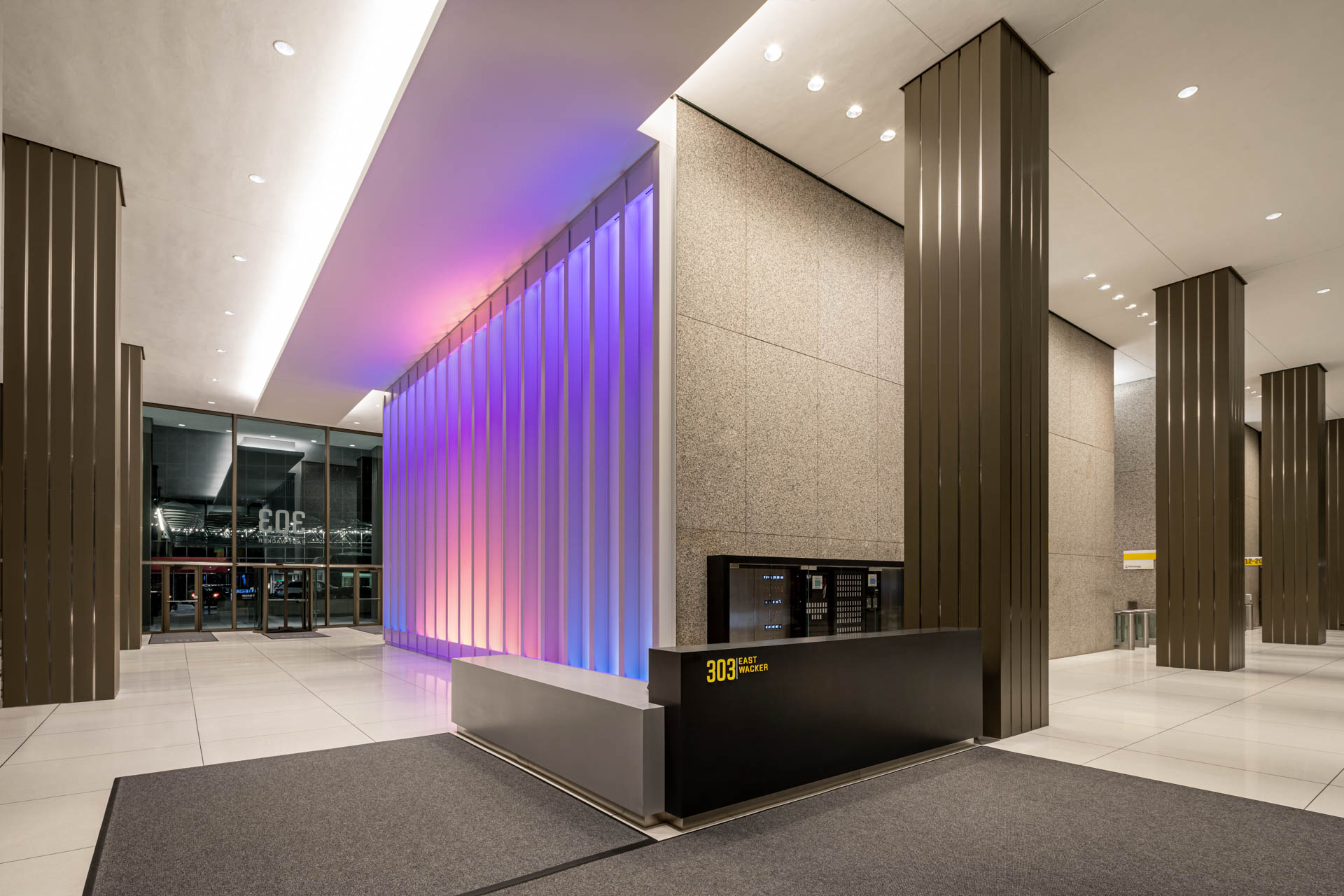
Despite its prominent location, 303 East Wacker lacked the modern finishes that attract today’s tenants, and its colorless, rectilinear International Style architecture appeared bland and aged on the skyline.
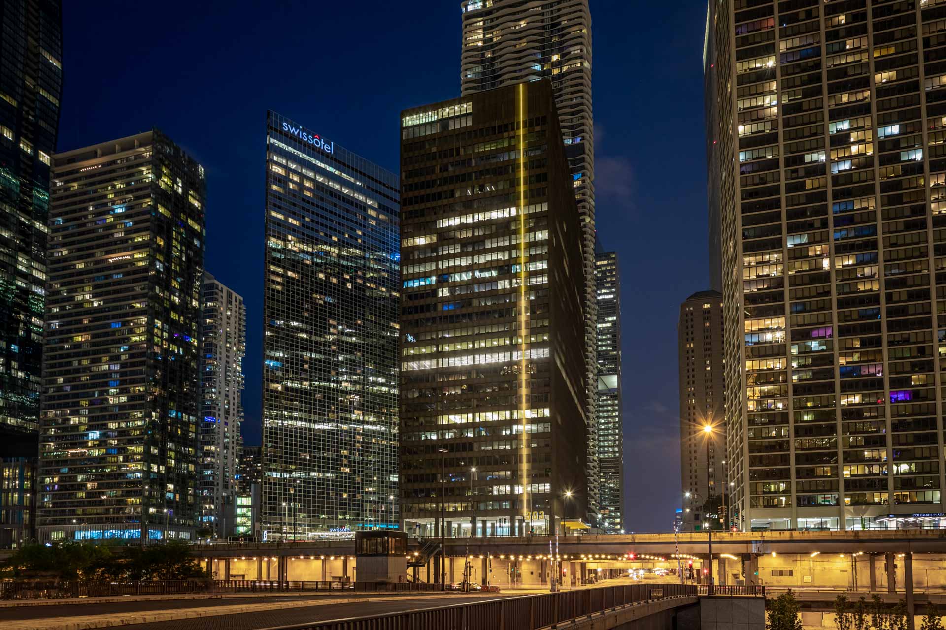
After our repositioning, the building now shines brightly on the Chicago River through an updated design reminiscent of modern lighthouses.
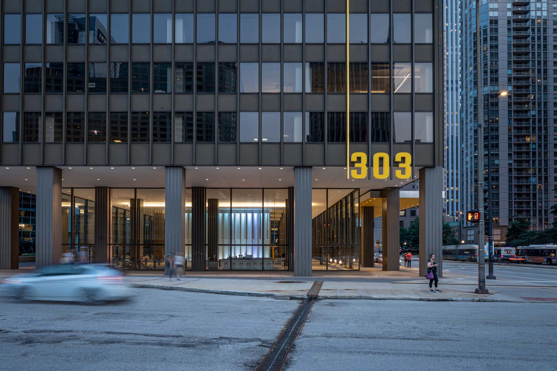
A prominent stripe, or “zipper,” of dynamic color runs up the side of the building, making it pop in the crowded Chicago skyline. The design language of the stripe, its sleek silhouette and burst of color, is repeated in the font choices and accent colors used throughout the building.
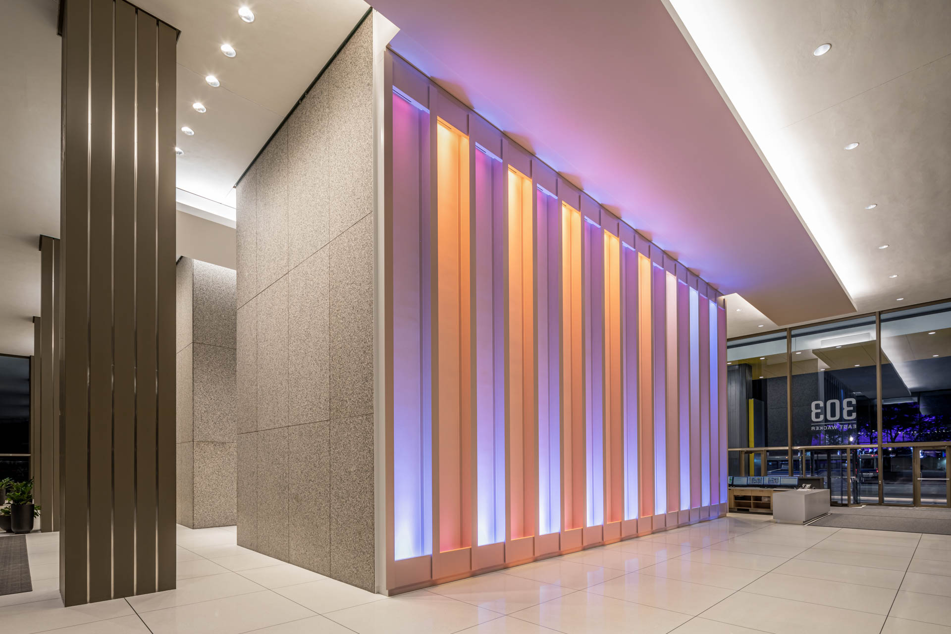
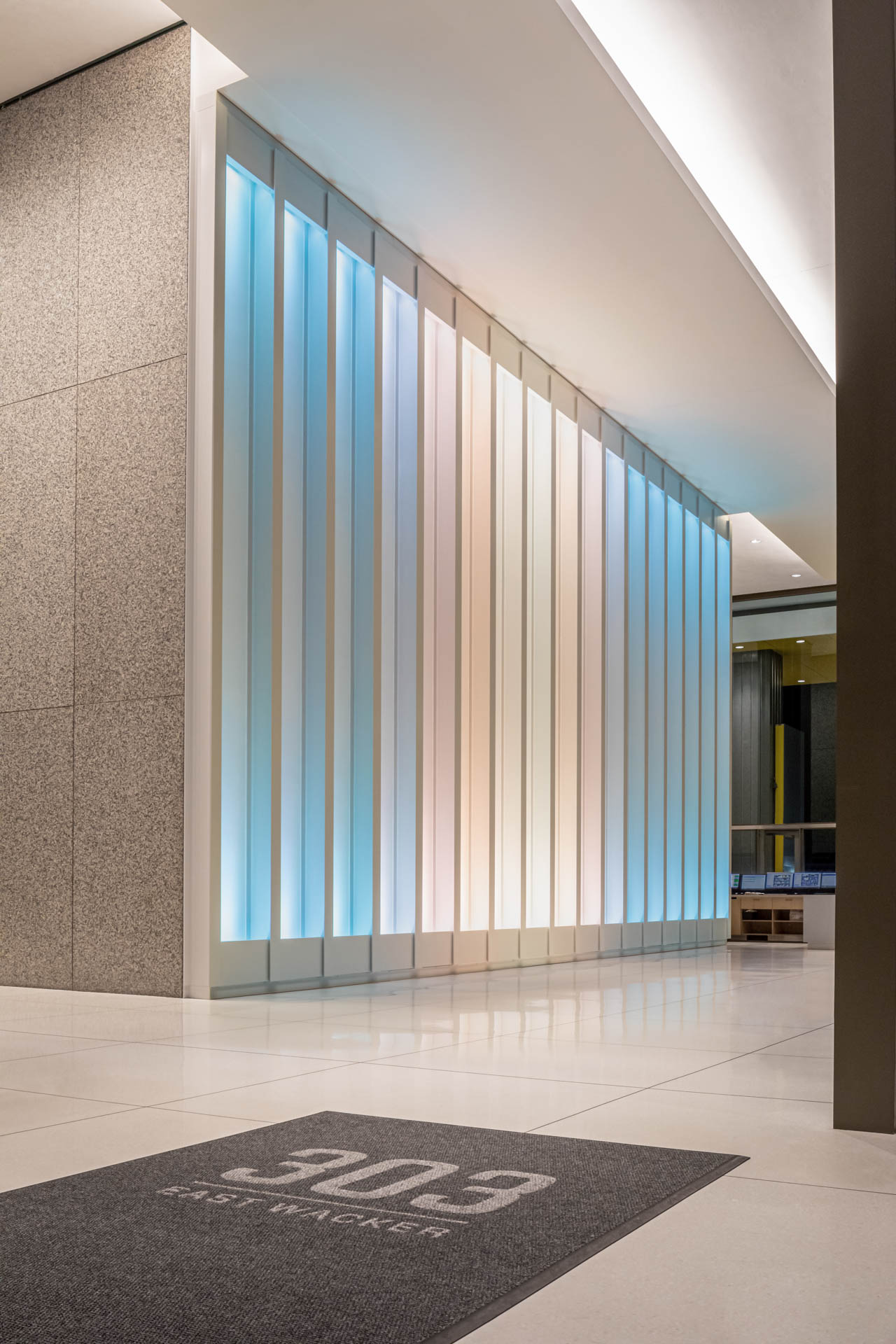
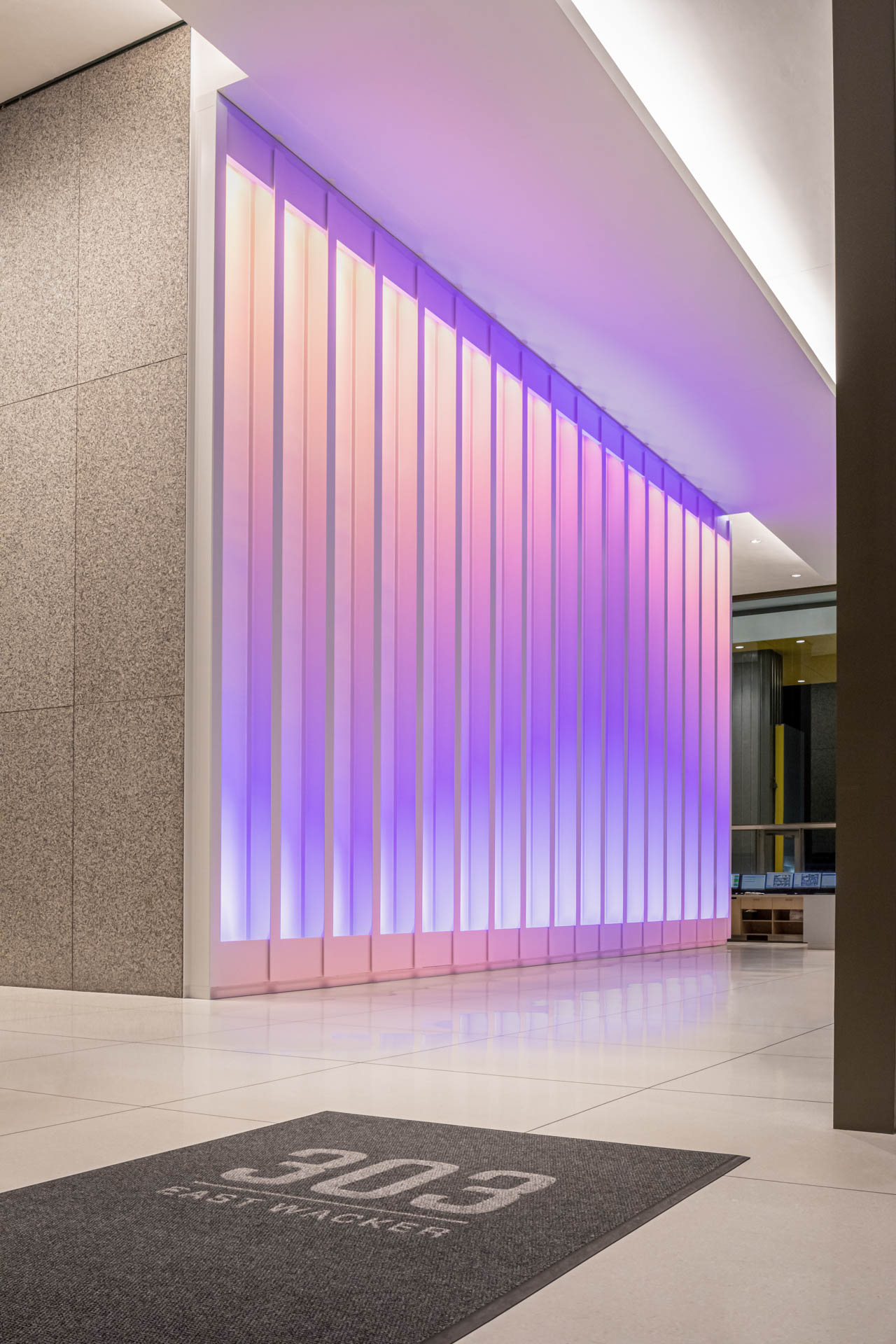
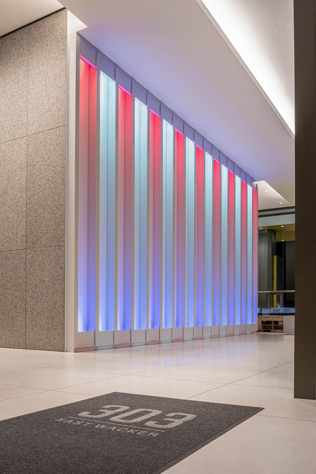
Inside the lobby, lighting bays wrap the elevator and feature animations similar to the movement, pattern, and play of the lantern at the center of a lighthouse. Each bay features two RGBA lighting fixtures, concealed at the top and bottom of the wall. Each fixture has four individually-addressable pixels to allow for low-resolution animations and light shows. The lighting program is scheduled to correspond to the ebb and flow of tenants passing through the lobby at different times of day, and changes over the course of the work week.
CN Core Responsibilities /
/ Lead Designer & client contact
/ 3d design, detailing and rendering
/ Lighting prototyping & art direction
/ Interior Design & furniture
/ Construction administration

Client / Beacon Capital Partners
Experience Design / ESI Design
Architect / WHA Archtitects
Specialty Fabricator / Kubic Maltbie
Lighting Integrator / EOS Light Media

800 N Brand Blvd, Glendale, CA / 2020
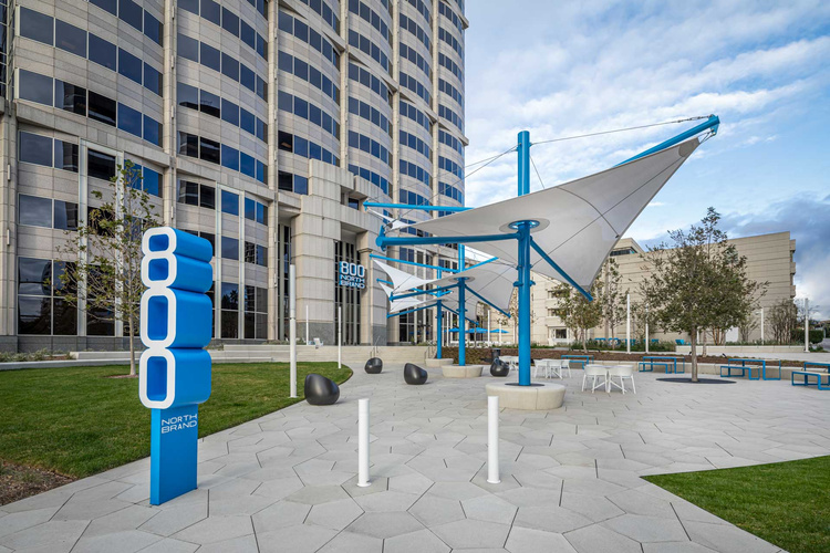
The outdated design and lack of tenant amenities at 800 North Brand, which was built in 1990, posed a challenge. The building's plaza was underused, and it lacked the contemporary features that are now expected in offices, such as street presence and a creative focal point. We addressed this challenge by creating a new building identity that draws inspiration from the surrounding geography of hills, valleys, arroyos, and mesas.
To create a more inviting outdoor space, we designed a new multi-purpose plaza that features different amenity zones, each with its own custom shading, unique furniture groups, and specialized structures. These zones include a large multi-purpose lawn with communal seating, game equipment with individual lounges, and a café with attendant furniture. At night, dynamic lighting brings the plaza to life and connects it to the media art wall in the lobby.
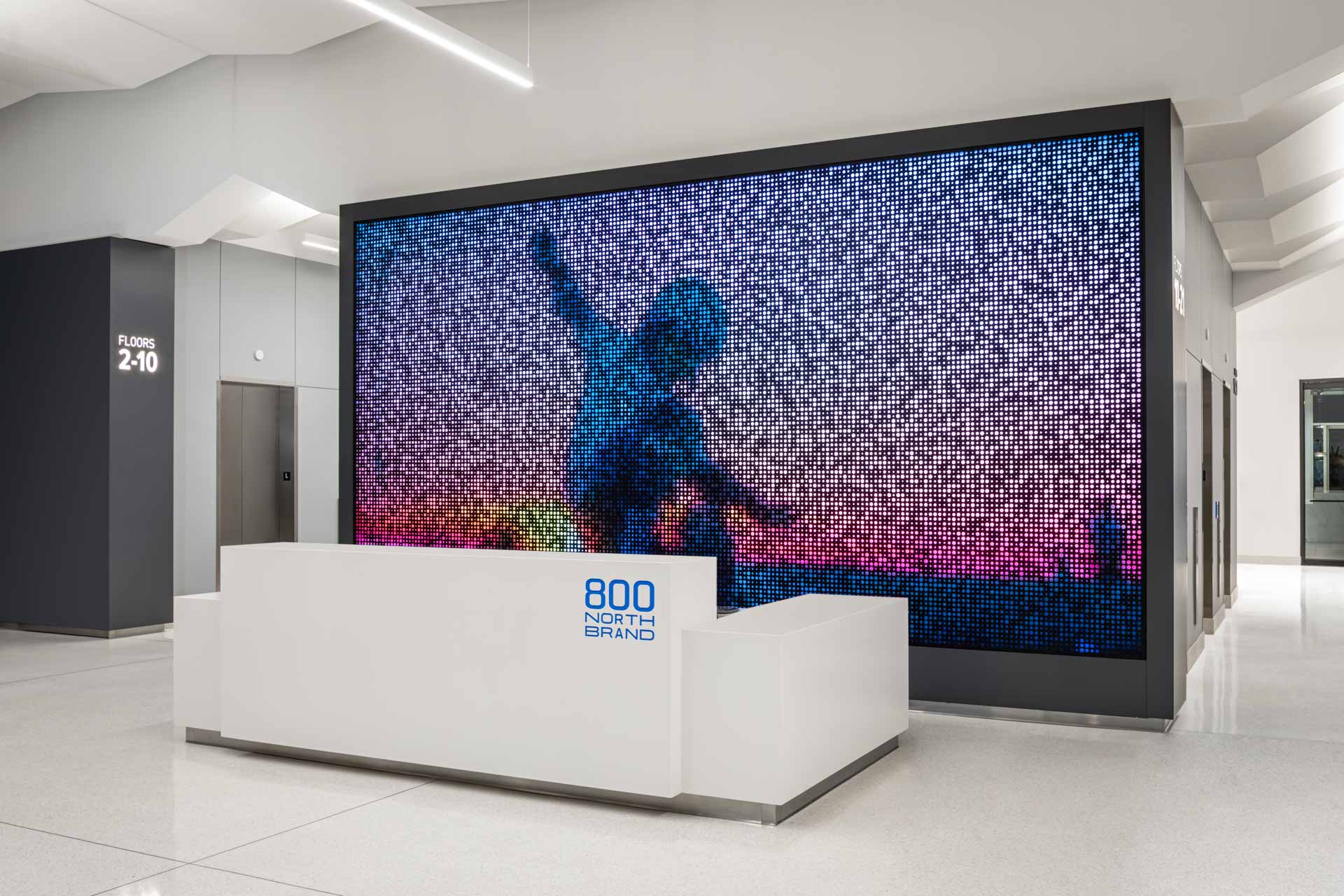
The lobby's dynamic art installation reflects the Southern California lifestyle and connects the building interior to the surrounding environment. By combining still images of local nature, crowds, and highway traffic with patterns generated in software, the installation creates moving compositions that express the local spirit using "iconic motion."
800 North Brand's transformation demonstrates how older buildings can attract new tenants by creating a new building identity. The diverse range of amenities encourages tenants to create their own journeys and connect with others over shared interests and activities. Additionally, the algorithmic digital art installation ensures that the space feels dynamic and continues to reflect the creativity of the building's tenant base.
CN Core Responsibilities /
/ Lead Designer & client contact
/ 3d design, detailing and rendering
/ Lighting/Media wall detailing and prototyping
/ Interior Design & furniture
/ Plaza planning and coordination
/ Construction administration




Client / Beacon Capital Partners
Experience Design / ESI Design
Landscape Architect / RELM
Specialty Fabricator / Scenic Route
Lighting/Video Integrator / Available Light

44 Montgomery St, San Francisco, CA / 2019
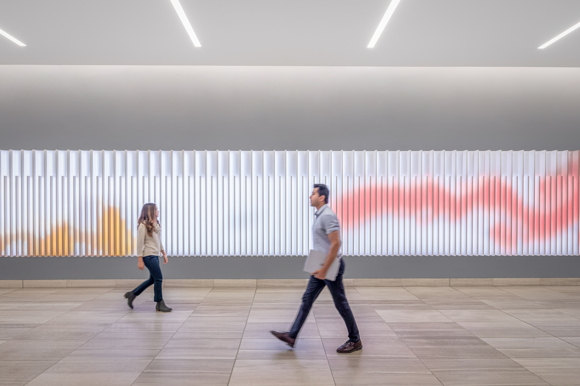
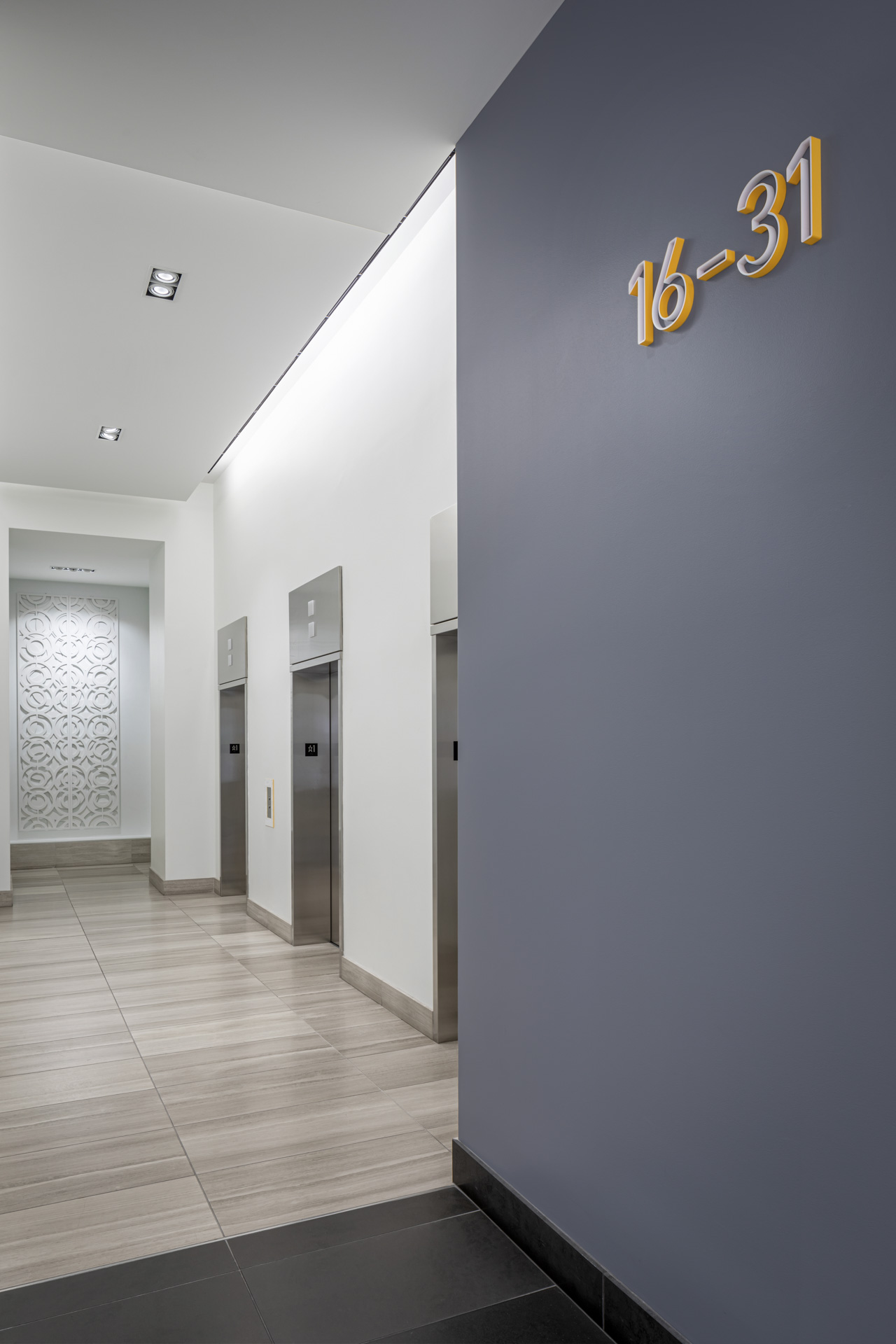
This 43-story tower situated at one of San Francisco's busiest intersections in the Financial District needed a lobby that matched the energy and vibrancy of its tenants. We came up with a media installation for the lobby that responds to the movements of passersby, giving the space a sense of liveliness and activation. The installation is powered by a suite of 5 FLIR cameras that track visitors' movements, turning them into digital paintbrushes and leaving colorful trails across the display. As more people fill the lobby, the media becomes more dynamic and colorful, with a variety of brush types and sizes that mix and create unexpected patterns.
The custom-designed media content is played on a ribbed surface that mimics the tower's facade fins, casting shadows and reflections that change over time. Our approach took advantage of the lobby's long horizontal orientation and creates a striking contrast with the mostly monochrome space. The redesign not only enhances the experience of existing tenants but also attracts new business, establishing 44 Montgomery as a prominent San Francisco destination.
CN Core Responsibilities /
/ Lead Designer & client contact
/ 3d design, detailing and rendering
/ Lighting/Media wall detailing and prototyping
/ Interior Design & furniture
/ Construction administration


Client / Beacon Capital Partners
Experience Design / ESI Design
Architect / Revel
Specialty Fabricator / Kubic Maltbie
Lighting/Video Integrator / Diversified
